Age Structure Diagrams
Jack Wilson
6 min read
Listen to this study note
Study Guide Overview
This study guide covers age structure diagrams (population pyramids), their interpretation, and their significance in understanding population dynamics. It explains the three main age categories (pre-reproductive, reproductive, post-reproductive) and how diagram shapes (pyramid, column, inverted pyramid) reflect population growth trends (rapid, stable, declining). Examples of different growth patterns are provided, along with key takeaways and exam tips focusing on interpreting diagrams and relating them to societal factors and resource availability.
#Population Dynamics: Age Structure Diagrams
Hey there, future AP Environmental Science ace! Let's break down age structure diagrams – they're like population snapshots that reveal a ton about growth trends. Think of them as your crystal ball for predicting population futures!🔮
#Understanding Age Structure
An age structure diagram (also called a population pyramid) is a graphical representation of the distribution of a population by age groups and sex. It's a powerful tool for understanding population dynamics.
#Age Categories
- Pre-reproductive: 0-14 years old
- Reproductive: 15-44 years old
- Post-reproductive: 45+ years old
These categories help us understand the potential for future population growth. A large pre-reproductive group means a lot of future parents!
#Diagram Shapes and What They Mean
Different shapes of age structure diagrams tell different stories:
- Pyramid Shape (Wide Base): Indicates rapid population growth. Many young people are entering their reproductive years, leading to a population boom. Think of it like a rocket ship about to take off! 🚀
- Column Shape (Even Distribution): Indicates stable population growth. The number of people in each age group is relatively similar, which means that the population is neither growing nor shrinking significantly. This is like a steady, balanced train. 🚂
- Inverted Pyramid Shape (Narrow Base): Indicates a declining population. There are fewer young people than older people, which suggests that the population will shrink over time. This is like a melting ice cream cone. 🍦
Think of the shape as a story:
- Wide base = Growing population
- Even sides = Stable population
- Narrow base = Shrinking population
#Examples in Action
#Rapid Growth: Ethiopia
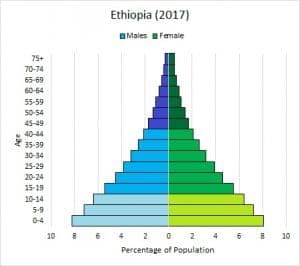
- Description: Notice the wide base of this diagram. There are many more children than adults.
- Interpretation: This indicates a high birth rate and a rapidly growing population. This is common in developing countries with high fertility rates.
#Stable Growth: New Zealand
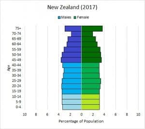
- Description: This diagram shows a relatively even distribution across age groups.
- Interpretation: This suggests a stable population with a birth rate that is close to the death rate. This is common in developed countries with access to family planning and reproductive education.
#Key Takeaways
- Age structure diagrams are essential for predicting future population trends.
- They help us understand the impact of birth rates, death rates, and societal factors on population growth.
- Different shapes reveal different stages of population growth.
Age structure diagrams are not just about numbers; they reflect social, economic, and environmental conditions of a population.
#Final Exam Focus
High-Priority Topics:
- Interpreting age structure diagrams to determine population growth trends.
- Relating diagram shapes to birth rates, death rates, and societal factors.
- Understanding how population growth impacts resource availability and the environment.
Exam Tip: When analyzing diagrams, pay close attention to the relative sizes of the pre-reproductive, reproductive, and post-reproductive age groups. This will give you clues about the population's future.
Common Mistake: Confusing a wide base with a stable population. Remember, a wide base indicates rapid growth, not stability!
#Practice Questions
Practice Question
#Multiple Choice Questions
-
A country with a large pre-reproductive population and a small post-reproductive population is likely experiencing: (a) Population decline (b) Slow population growth (c) Rapid population growth (d) Zero population growth
-
A population pyramid that is column-shaped indicates: (a) Rapid population growth (b) Declining population (c) Stable population (d) Exponential population growth
#Free Response Question
Consider the following age structure diagrams representing two different countries:
Country A: A pyramid-shaped diagram with a very wide base. Country B: A column-shaped diagram with relatively even distribution across age groups.
(a) Identify the type of population growth pattern represented by each country and explain your reasoning. (2 points) (b) Describe two potential social or economic challenges that Country A might face due to its population structure. (2 points) (c) Describe one potential benefit that Country B might experience due to its population structure. (1 point) (d) Explain how changes in birth rates and death rates could shift Country A's population structure over time. (2 points)
#FRQ Scoring Breakdown
(a) (2 points)
- Country A: Rapid population growth. (1 point)
- Reasoning: The wide base indicates a high proportion of young people entering their reproductive years. (1 point)
- Country B: Stable population growth. (1 point)
- Reasoning: The even distribution across age groups indicates a balance between birth and death rates. (1 point)
(b) (2 points)
- Any two of the following (1 point each):
- Strain on resources (food, water, housing)
- High unemployment rates
- Overcrowding and sanitation issues
- Increased pressure on education and healthcare systems
(c) (1 point)
- Any one of the following (1 point):
- More stable workforce
- Better social security system
- More predictable economic growth
(d) (2 points)
- A decrease in birth rates and/or an increase in death rates in Country A would shift its population structure towards a column or inverted pyramid shape. (1 point)
- Explanation: Lower birth rates would reduce the size of the pre-reproductive group, and higher death rates would reduce the size of the reproductive and post-reproductive groups. (1 point)
Alright, you've got this! Keep reviewing, stay confident, and you'll nail that AP Environmental Science exam! 💪
Continue your learning journey


How are we doing?
Give us your feedback and let us know how we can improve