Principles of Design for AP3D
Maya King
10 min read
Listen to this study note
Study Guide Overview
This study guide covers the principles of 3D design for the AP Art & Design exam, including opacity/transparency, value/contrast, time, rhythm, movement, proportion/scale, balance, emphasis, repetition, figure/ground relationship, connection/juxtaposition, and hierarchy. It explains how these principles apply to 3D artwork, provides examples, and offers tips for the exam, including common question types and high-priority topics like balance, emphasis, and figure/ground relationship. Practice questions and scoring breakdowns are also included.
#AP Art & Design 3D: Principles of Design - The Night Before 🚀
Hey there, future art star! Feeling the pre-exam jitters? Don't worry, we've got you covered. This guide is designed to be your ultimate review, hitting all the key concepts you need for the AP Art & Design exam, especially focusing on 3D principles. Let's dive in and make sure you're feeling confident and ready to rock! 😎
#Core Principles of 3D Design
These principles are your artistic toolkit. They apply across all art forms, but we'll see how they specifically play out in 3D work. Remember, the AP exam loves to see how you can apply these concepts, so think of them as your secret weapons! 😉
#1. Opacity/Transparency
-
Definition: How much light can pass through an object. Think of it as the opposite of solidness. 💡
-
3D Application: Manipulating materials to be see-through or solid. Using light and shadow to enhance these effects.
-
Example:

Key Point: Opacity/Transparency is not just about the material itself, but how you use light and shadow to enhance the effect. Think about how you can use these elements to create depth and interest.
#2. Value/Contrast
-
Value: The lightness or darkness of a color.
-
Contrast: The difference between light and dark values.
-
3D Application: Creating depth and form through light and shadow. High contrast can make forms pop, while low contrast can make them recede.
-
Example:

Exam Tip: When analyzing artwork, look for how the artist uses value to create form and contrast to create emphasis. Mentioning specific areas of high or low contrast will show a deeper understanding.
#3. Time
-
Definition: How elements change or imply change over time.
-
3D Application: Using materials, forms, and surface treatments to suggest age, movement, or a sense of the past/future.
-
Example:

Memory Aid: Think of 'Time' as a story. How does your work tell a story about the past, present, or future? Are there elements that suggest change or movement over time?
#4. Rhythm
- Definition: The visual beat created by repeating elements, like a pattern.
- 3D Application: Using spacing, size variations, and repetition of forms to guide the eye and create a sense of movement.
- Example:

#5. Movement
-
Definition: The path the eye takes through a work of art, or the illusion of motion.
-
3D Application: Using lines, forms, and directional elements to guide the viewer's eye and create a sense of flow.
-
Example:

Common Mistake: Don't confuse 'Rhythm' with 'Movement.' Rhythm is about repetition, while movement is about guiding the viewer's eye. They often work together, but they are distinct concepts.
#6. Proportion/Scale
- Scale: The size of objects in relation to each other.
- Proportion: The relative size of parts within an object.
- 3D Application: Creating a sense of harmony or disharmony through the size relationships of different elements.
- Example:

#7. Balance
-
Symmetrical Balance: Mirror-like balance where both sides are equal.

-
Asymmetrical Balance: Unequal sides that still create a visual balance.

-
Radial Balance: Elements radiating from a central point.

Quick Fact: Remember the three types of balance: symmetrical (mirror), asymmetrical (unequal but balanced), and radial (from a center). Being able to identify these quickly will help you on the exam.
#8. Emphasis
- Definition: The focal point of a design where the eye is drawn to.
- 3D Application: Using placement, size, color, and other elements to create a point of interest.
- Example:

#9. Repetition
- Definition: Using the same object or element multiple times in the same way.
- 3D Application: Creating patterns and rhythms by repeating forms, textures, or colors.
- Example:

#10. Figure/Ground Relationship
- Definition: How the foreground and background interact, creating positive and negative space.
- 3D Application: Using forms, colors, and textures to create tension and interplay between the object and its surroundings.
- Example:

#11. Connection/Juxtaposition
- Connection: Placing similar objects together to show their likeness.
- Juxtaposition: Placing different objects together to highlight their differences.
- 3D Application: Using combinations of forms and materials to create relationships and contrasts.
- Example:

#12. Hierarchy
-
Definition: Arranging visual information to show importance.
-
3D Application: Using size, placement, and detail to emphasize certain elements over others.
-
Example:

High-Value Topic: Understanding how these principles interact is crucial. AP questions often ask you to analyze how multiple principles are used in a single piece. Look for those connections!
#When Do I Use the Principles of Design?
- Always! These principles are the foundation of all art. They are not just rules, but tools to help you create compelling work. Use them in your thumbnails, sketches, and final pieces. Experiment and see how they can transform your ideas. 😄
#Final Exam Focus
Okay, let's get down to brass tacks. Here's what to focus on for the exam:
- High-Priority Topics:
- Balance: Be able to identify and describe symmetrical, asymmetrical, and radial balance.
- Emphasis: Understand how to create a focal point and how it guides the viewer's eye.
- Figure/Ground Relationship: Be able to discuss how the foreground and background interact to create positive and negative space.
- Interconnectedness: Practice analyzing how multiple principles work together in a single artwork.
- Common Question Types:
- Multiple Choice: Expect questions that ask you to identify principles in given artworks.
- Short Answer: Be ready to explain how an artist used specific principles to achieve a particular effect.
- Free Response: You'll likely need to analyze a piece of art, discussing how the principles are used and how they contribute to the overall meaning or impact.
- Last-Minute Tips:
- Time Management: Don't spend too long on any one question. Move on and come back if you have time.
- Common Pitfalls: Avoid vague language. Be specific and use correct terminology.
- Strategies: When analyzing, start with the most obvious principles and then look for more subtle ones. Think about how they all work together to achieve the artist's intention.
#Practice Questions
Practice Question
Multiple Choice Questions:
-
Which principle of design is most evident in a sculpture that uses a series of repeated shapes to create a sense of movement? a) Emphasis b) Balance c) Rhythm d) Hierarchy
-
A 3D artwork features a large, brightly colored form contrasted against a smaller, muted background. Which principle is primarily being used? a) Proportion b) Value/Contrast c) Repetition d) Figure/Ground
-
An artwork that is identical on both sides, as if reflected in a mirror, is an example of: a) Asymmetrical Balance b) Radial Balance c) Symmetrical Balance d) Emphasis
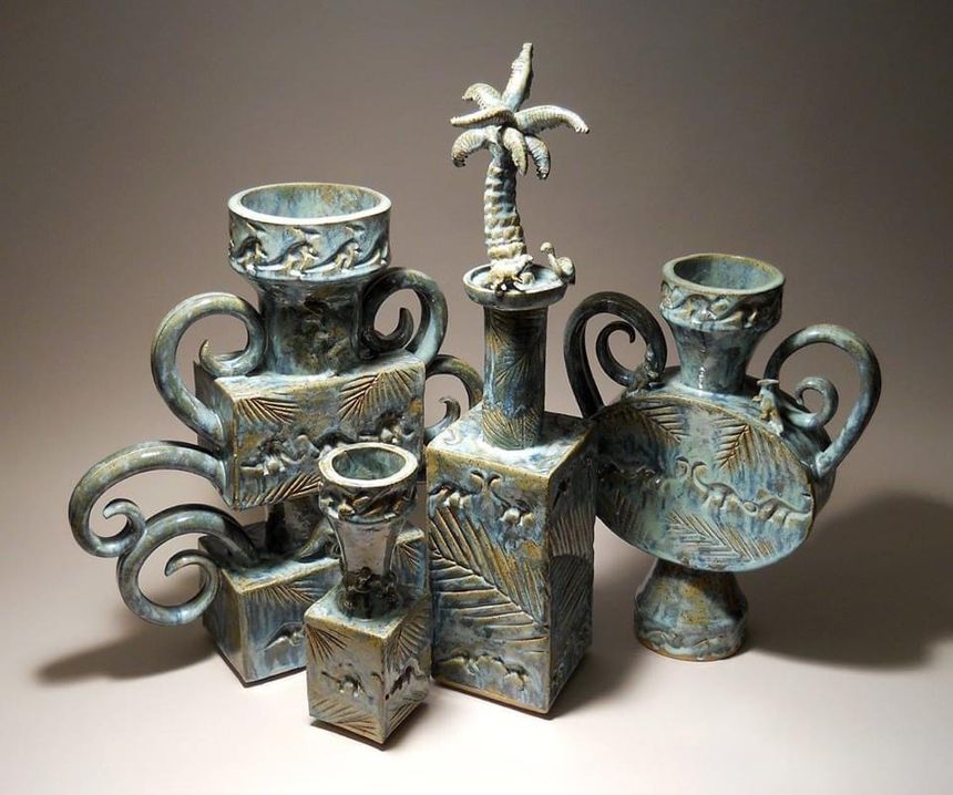
Free Response Question:
Analyze the provided image (https://zupay.blob.core.windows.net/resources/files/0baca4f69800419293b4c75aa2870acd_20a44c_3501.jpg?alt=media&token=0e9f28c4-8406-4ede-bcdf-af0dca5ffcaf) in terms of at least three principles of design. Explain how these principles contribute to the overall aesthetic and meaning of the artwork. (6 points)
Scoring Breakdown:
- Identification of Principles (3 points): 1 point for each correctly identified principle (e.g., scale, proportion, rhythm). You must accurately identify the principle and describe it in the context of the artwork.
- Explanation of Contribution (3 points): 1 point for each clear explanation of how the identified principle contributes to the artwork's aesthetic and meaning. This should go beyond simple identification and discuss the effect of the principle on the overall piece.
Example Answer:
This artwork demonstrates a clear use of scale, with the various vessels differing significantly in size. The proportion of the handles to the bodies of the vessels also varies, creating visual interest. Additionally, the arrangement of the vessels creates a sense of rhythm, as the eye moves from one form to the next. The varying scales of the objects create a dynamic visual experience, while the proportional differences within each vessel add to their individual character. The overall effect is a visually engaging composition that explores the interplay of form and size.
Alright, you've got this! Go into that exam with confidence and show them what you've learned. You're an artist, and you're ready to shine! ✨
Continue your learning journey


How are we doing?
Give us your feedback and let us know how we can improve